
Microsoft’s operating system, Windows 8 (hereafter Win 8), succeeds the traditional desktop interface of Windows XP and Windows 7 while providing superior hardware support. Users can upgrade seamlessly and enjoy a noticeably snappier experience. Crucially, Win 8 introduces a defining feature absent in Win 7: the modern Metro GUI.
Beyond conventional desktop PCs, Microsoft envisioned unifying desktops, smartphones (such as the Nokia Lumia 920), and tablets (such as the Surface) under a single cohesive user experience. This clearly demonstrates Microsoft’s ambition to recapture market share lost to rivals in recent years.
The Metro GUI drew inspiration from public transit signage. A bus stop sign must present multiple routes clearly and compactly so commuters can instantly identify what they need. For smartphone and tablet users, scanning a compact screen to locate desired functions requires the exact same intuitive visual hierarchy as checking a bus sign.
For software developers and designers in Microsoft’s ecosystem, mastering how to design for the Metro GUI—and truly understanding its design philosophy—has become essential new curriculum.
In essence, the Metro GUI is a "**content-centric**" graphical interface. While Apple and Google pursue similar clarity on smartphones, Microsoft’s execution and breadth of application differ subtly.
Metro GUI is built upon a three-tier hierarchy: imagine standing by the street (the screen), selecting a specific bus stop sign among many (the first tier, the root menu), picking a specific route number from that sign (the second tier, the submenu), and finally reading detailed transit information such as current location, departure schedule, and fares (the third tier, content-oriented details).
When Windows 7 and Vista debuted, desktop Widgets were a novel curiosity for me (even though third-party equivalents existed on XP, I always avoided installing extraneous background utilities).
By Windows 8, although desktop gadgets still technically exist, they have been relegated to obscurity—disabled by default and stripped of developer attention. Without specific niche needs, they will likely fade from collective memory before long.
The root cause is straightforward: the design philosophy of desktop Widgets directly contradicts that of the Metro GUI.
In retrospect, desktop widgets were overly flashy yet lacked sustained utility (and never developed a healthy commercial ecosystem to attract top developers). Widgets behaved much like the repetitive audio announcements on the Taipei MRT: taking up significant workspace, adding background resource overhead, yet offering very little functionality. Moreover, letting developers arrange arbitrary floating layouts created a cluttered desktop mess.
I always considered widgets ambiguous: having too many was unbearable, yet having only a few felt pointless. Metro GUI completely upends this accessory paradigm.
Out of the box, Windows 8 essentially turns widgets into the operating system itself. Booting up lands you in the Metro GUI, where apps and live widgets populate the screen at once (complete with real-time indicators like unread email counts). Microsoft redesigned its core heavyweight applications specifically around Metro’s philosophy—including Internet Explorer, messaging tools (Messenger, Skype), Mail, Weather, Photos, and multimedia apps. Even Office 2013 was heavily influenced by this design direction.
To summarize in a single sentence: it consolidates and streamlines fragmented functions, displaying only the exact content users need. That is the definition of content-driven design.
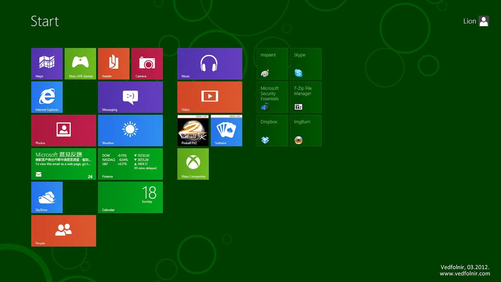 Windows 8 Metro
However, one of the central pillars of the Metro GUI—radical information simplification—also conceals a potential hazard.
As third-party developers jump in with varying design philosophies, if an app provides "**too little information**", it becomes underpowered and gets abandoned by users; if it packs "**too much information**", an interface meant to be clean becomes convoluted and cumbersome. Accessing secondary functions inside an oversimplified interface often requires far more taps than on a traditional complex interface.
Ultimately, frustrated users will abandon such apps in search of alternatives. Calibrating the right depth of information will challenge many software creators, making user onboarding and UX education paramount.
Knowing where to draw the line between essential and extraneous features will prove particularly tough for legacy enterprise software. The larger a program’s user base, the harder it is to overturn established habits. New apps face less legacy baggage; their creators can focus entirely on refining the user experience.
If I were developing a Metro app today, deciding what to display would no longer be a purely internal team decision. It would require substantially greater investment in pre-development market research and usability testing.
Traditional software design assumptions—and even majority vs. minority user feedback—must be thoroughly re-evaluated.
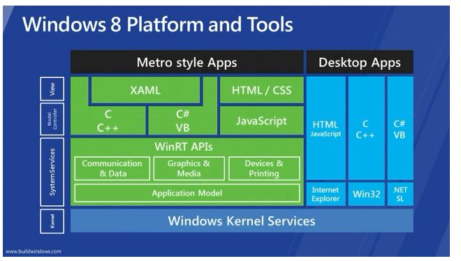
Windows 8 Platform and Tools
Another potential risk is Metro GUI’s rigid vertical navigation paradigm. As noted earlier, Metro employs a three-tier model. In concept, it is not radically different from classic desktop folder hierarchies, but Metro strictly enforces this flow. This rigid framework risks constraining intuitive thinking patterns that users have spent decades cultivating.
It would be fascinating to poll user sentiment toward Metro GUI across different demographics, as thinking processes and workflow habits vary considerably.
Ultimately, I suspect developers will continue prioritizing traditional desktop interface designs for power users, while desktop PC users may only visit the Start screen to launch an app before retreating immediately to the classic desktop. If so, could Metro GUI on the desktop risk becoming another underutilized novelty like widgets before it?
Fortunately, on smartphones and tablets, this risk is minimal. On smaller touchscreens where complex multi-window manipulation is unwieldy, Metro’s full-screen focused approach becomes an outright asset.
In other words, while Microsoft implemented Metro GUI across all three device categories, the appetite among traditional desktop users remains relatively modest. During my early days with Windows 8, switching back and forth between Metro and the classic desktop felt disjointed, and the inability to bypass the Metro Start screen by default was genuinely frustrating.
That frustration, however, may stem from not yet acclimating to Metro’s conveniences, coupled with my heavy reliance on Google’s cloud ecosystem—at a time when Google had yet to build native apps for Microsoft’s new platform.
Yet as the saying goes, every challenge brings opportunity. Complaining about the lack of Google integration on Windows 8 simply showed how eagerly I anticipated Win 8’s potential. Beyond my personal workflow, there is an enormous demographic without these legacy constraints who will find Metro’s touch-first workflow completely natural.
My advice to developers: avoid attempting a one-size-fits-all experience across desktops, smartphones, and tablets. Even though mobile devices are proliferating rapidly, user contexts and operational habits differ fundamentally across form factors. Keeping application architectures thoughtfully tailored for each environment is best practice. (While Apple deliberately maintains boundaries between macOS and iOS apps, Microsoft aims to bridge them through Metro. With the Windows Store still in its infancy, its long-term trajectory remains to be seen.)
While I admire the boldness and fresh visual presentation of the Windows Metro GUI, widespread user adoption is another matter entirely. For my daily desktop workflow right now, the desktop Metro screen offers limited utility because Google Chrome is already so capable. Chrome remains the hub of my workflow, from which I launch other specialized utilities as needed.
Much of modern computing can be handled entirely within the browser (though Google Docs still lags behind Microsoft Office in depth). Meanwhile, smartphones running Windows Phone featuring Metro still trail Google Android and Apple iPhone by a wide margin in market visibility.
While Nokia’s industrial hardware design is outstanding, few users wish to be guinea pigs—and Nokia’s earlier Windows Phone 7 lineup certainly bore the brunt of early adoption pains.
As for the much-anticipated Surface tablet, initial reviews appear more positive than negative, but a fair verdict must wait until we can test it hands-on. Microsoft will always prioritize feature rollout and support for its US home market, but once it reaches Taiwan, whether local services and language features will feel compromised remains to be seen. Personally, I look forward to seamless Skype integration throughout the Windows ecosystem—that alone would make international calling delightfully effortless.
Further Reading
Support Independent Perspectives & In-Depth Insights
Every thoughtful analysis and candid critique comes from our dedication to truth and quality. We choose not to follow sensational algorithms or clickbait headlines.
Sustaining independent research requires reader support. Make a one-time or monthly contribution, securely processed by Google.
Payments secured by Google · Manage or cancel anytime in your Google Account

Comments