
As a veteran user of the Apple ecosystem, iOS Notes has always been my most important idea vault. It syncs quickly and lays out cleanly; it should be the most perfect digital pocket notebook.
However, as I switch between iPhone, iPad, and Mac, I have found an extremely maddening design flaw: this program’s most important add button seems to play hide-and-seek across different devices, never in the place it should be.
The “Invisible” Button on Mobile
On the iPhone, the button to add a note is placed in the bottom-right corner of the screen. This position is extremely low-key, with no eye-catching differentiated design at all.
When I am in a hurry to record a fleeting idea, my finger always blindly searches the screen, yet is often obscured by the base of my right thumb, brushing past that tiny icon.
This layout that does not match usage habits abruptly cuts off the flow of creation.
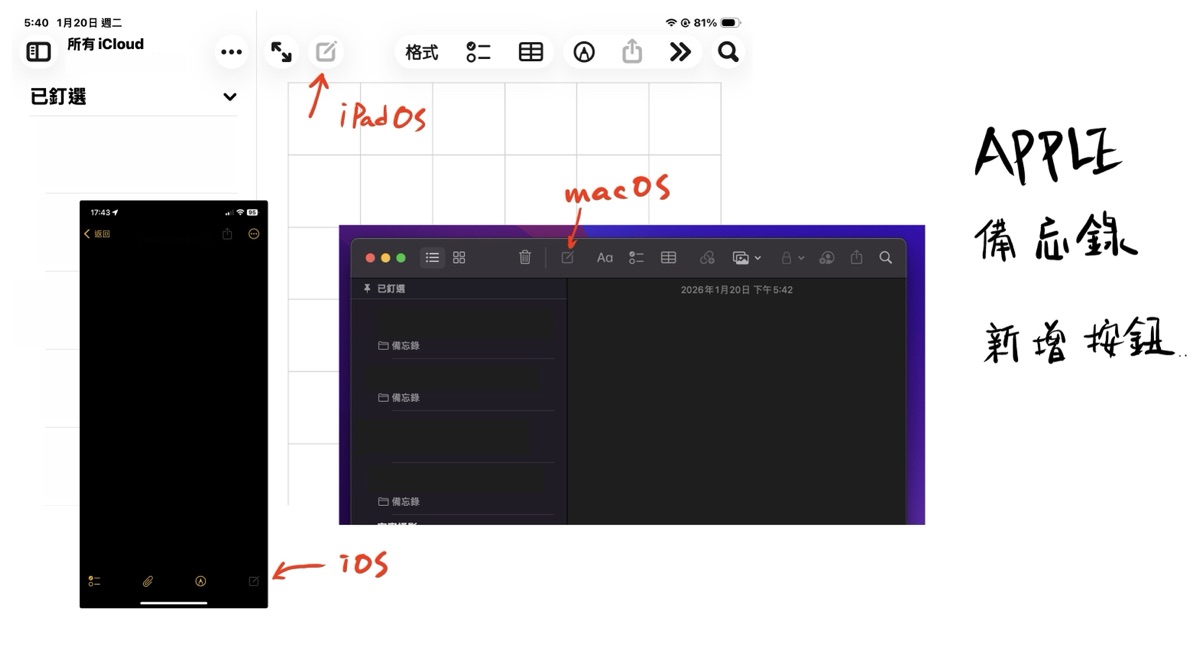
Apple iOS, iPadOS, macOS: the different Notes designs across three operating systems
iPad and Mac: A Cross-Platform Experience with Broken Logic
What is even more maddening is that this sense of chaos is infinitely magnified when using across devices.
When I switch to iPadOS, the add button has actually moved to the “upper-left” of the screen. This design gives an awkward feeling of being neither up nor down, matching neither the intuition of one-handed tablet operation nor the operating logic of the iPhone.
Although this position seems to try to move closer to the macOS Notes design, in actual operation it is again “not quite the same.” The result is:
- iPhone: bottom-right of the screen.
- iPad: upper-left of the screen, with an extra magnifier button on the left.
- Mac: center-left of the window toolbar.
Three Systems, Three Positions: A Killer of Efficiency
The same app has completely different core button positions across three operating systems.
This lack of consistency seriously confuses users’ operation — who knows whether Jobs is aware of it in the afterlife?
Every time you switch devices, your brain has to re-adapt to the click logic once more. For a note-taking app pursuing ultimate efficiency, this is undoubtedly a rookie mistake.
Apple touts the seamless integration of its ecosystem, yet on the most basic “add a note,” it leaves users lost in different corners of the screen. What we expect is not some flashy special effect, but a unified and prominent ”+” that lets intuition keep up with speed.
Support Independent Perspectives & In-Depth Insights
Every thoughtful analysis and candid critique comes from our dedication to truth and quality. We choose not to follow sensational algorithms or clickbait headlines.
Sustaining independent research requires reader support. Make a one-time or monthly contribution, securely processed by Google.
Payments secured by Google · Manage or cancel anytime in your Google Account


Comments