

Yesterday, I finished testing the newly released mobile application “Fly V Air” from V Air, and ended up leaving a scathing review with a detailed rant. On second thought, however, let’s keep professional critiques where they belong. Here is an honest, personal look at what went wrong—proceed with caution.
The competence of the developers contracted by V Air is seriously questionable (forgive me for saving this candid assessment for the write-up). As anyone can see from the screenshots in the accompanying article[1], the user interface design completely fails to comply with basic display standards: there are massive black borders letterboxing the interface, and the resolution is shockingly low (tested on: Apple New iPad).
Even worse, once the app installs, the shortcut icon placed on the home screen is an outright blunder, displaying a raw placeholder template as shown below.
It almost looks like the cute “V Bear” mascot was targeted in a crosshair by the developer and eliminated (the icon literally looks like a sniper reticle).
Hopefully, the programmers at V Air will notice and rectify this promptly.
(“Whispering voice: This honestly feels like something a high school student whipped up within a month of learning mobile app development, just taking a bit more time to hook into APIs.”)
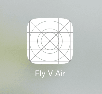 The Fly V Air App icon design on iOS.
Further Reading: “Fly to Bangkok and Chiang Mai with V Air from NT$1,388 (App Promo Code)”
Support Independent Perspectives & In-Depth Insights
Every thoughtful analysis and candid critique comes from our dedication to truth and quality. We choose not to follow sensational algorithms or clickbait headlines.
Sustaining independent research requires reader support. Make a one-time or monthly contribution, securely processed by Google.
Payments secured by Google · Manage or cancel anytime in your Google Account



Comments