
A few days ago, I uploaded a photo to Facebook, and fortunately, many friends loved it. Someone privately asked if I could print a large physical copy for her because she wanted to hang it on her bedroom wall. I remember telling her back then: “It looks good precisely because it is displayed on Facebook; if you blow it up into a large print, it won’t look great.”
Somewhat astonished, she asked me back: “Doesn’t everyone say photos look worse once uploaded to Facebook, while the original files look much better? Why are you saying the opposite?”
Hearing her question, a thought crossed my mind and I asked: “Did you hear some guy say that to a pretty girl?”
She answered: “Seems like it.”
I narrowed my eyes and said to her: “That’s just a pickup line guys use when flirting. The subtext is simply, ‘Why don’t you come over to my place so we can take our tiiiime looking at them?’”
--- Dividing line to return to the topic before I get mobbed by angry guys (the real reason was insufficient resolution) ---
First off, every image host or stock photo platform (such as Flickr, Facebook, iStockphoto, Canstock, Fotolia, 123RF, Dreamstime, and Shutterstock) genuinely uses different technologies for storing and processing graphics files.
If you think about it simply, these systems were never built by the same single programmer; the code quality and compression algorithms each team wrote naturally differ. Furthermore, commercial competition would never permit identical stacks. Yet they don’t diverge wildly either—after all, none of these major image hosting giants hire amateurs to build their core commercial pipelines.
However, if a photo uploaded to an image host is already mediocre to begin with, then even if my friend went over to that guy’s place to inspect it on a massive monitor, it wouldn’t magically look better. At most, it’s just what people call an inflated sense of self-satisfaction.
Girls, stop falling for guys telling you lines like: "**It looks bad on Facebook; let me show you the raw files next time!**" (dodging flying shoes from fellow men).
Image Analysis and Comparison Setup
Ahem—in any case, below I provide two sets of comparison images designed in our studio: one I call the “Four-Panel Image” comparison, and the other the “Color Box” comparison.
I should mention beforehand: in the process of preparing these comparison collages, each additional processing step slightly degrades the images. However, this negative factor is applied uniformly across all samples as an identical degradation factor. Therefore, these variables can be temporarily disregarded.
Four-Panel Image Comparison
Next, please look at the four-panel comparison below. I used a photo of a ginger cat taken at the Tamsui riverbank parking lot, taking screenshots and aligning them after opening the image on local desktop, Flickr, Picasa, and Facebook.
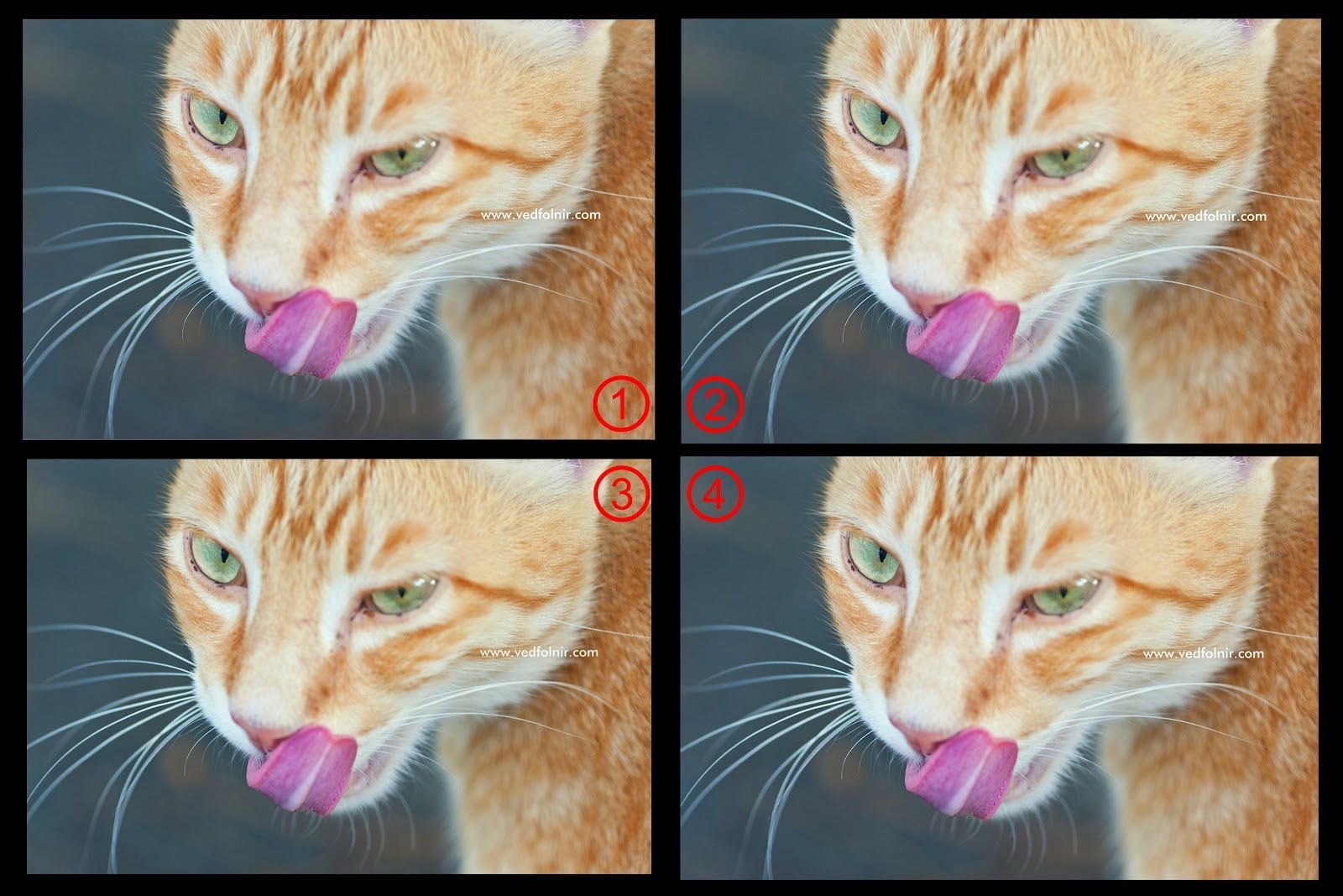 Four-panel image comparison.
Many people have developed a conditioned reflex to claims like “uploading to Facebook makes it worse” or “Flickr preserves better quality.” Therefore, we need to examine the images objectively across three dimensions: color reproduction, light/shadow tonal gradients, and fine texture details.
Regarding color reproduction and light/shadow gradients, based on my personal inspection of the four-panel image above, there was no dramatic difference. You are welcome to inspect the image above yourself to compare.
However, for the exact same photograph, I noticed that the image hosted on Flickr appeared brighter and more vivid than on the other two web platforms, and even compared to viewing locally on the computer. Does this hint help you spot which tongue belongs to the Flickr view?
Yet when it comes to dynamic range latitude in pure white highlights, the differences across all four samples are remarkably subtle. I stared until my eyes nearly popped out just to spot that tiny bit of discrepancy.
Additionally, color optimization on any photograph depends primarily on whether the photographer’s monitor was properly color-calibrated when adjusting the color profile on PC. But this argument only holds true for individual viewing.
If I tune a photo’s color today to match my emotional artistic intent, when others view that photo on their own uncalibrated screens, the tone could be completely shifted and no longer resemble what I intended to convey.
However, such inherent display differences are not directly related to which image hosting platform is used, and should not be conflated.
For individual viewers, discrepancies between colors on screen and the photographer’s ideal hue won’t create night-and-day differences merely because of the hosting provider. The experimental approach of this article aims to minimize subjective bias as much as possible—letting the rendered output speak for itself.
Color Box Comparison
Next, let’s examine the Color Box image.
The Color Box consists of black, gray, and white stepped gradients alongside solid color blocks. It was similarly displayed on local computer, Flickr, Picasa, and Facebook, captured via screenshots, and compiled into a single comparison layout.
Looking at the results, across color, contrast, and resolution variations, I personally still cannot discern significant differences (or is there something wrong with my eyesight?).
Reflecting on it later, this test pattern doesn’t exhibit complex high-frequency features in linear images (Linear image), so for each platform’s rendering engine, it likely falls under relatively basic raster processing (sticks tongue out).
Can you spot the differences between these images right now? (I’ll design test targets with complex curves next time.)
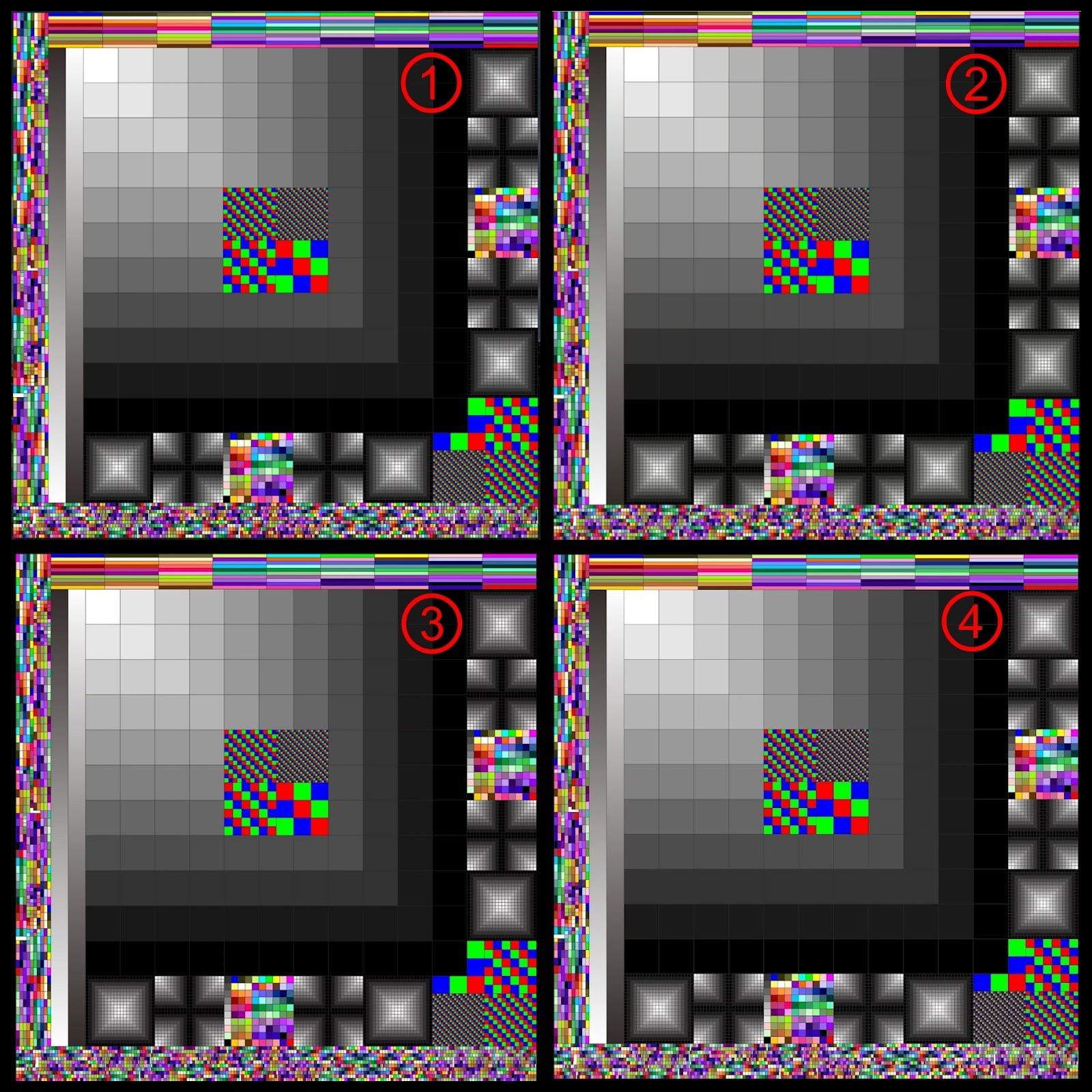 Color Box comparison.
Conclusion on Image Hosting Differences
After analyzing the two tests above, if you can genuinely spot the differences, you should be thrilled, because it proves three things:
- Your eyesight is excellent;
- Your eyesight is super excellent;
- Your eyesight is universally, extraordinarily unmatched.
In truth, the subtle differences present in these images are quite difficult for non-professional photographers to distinguish.
Had we not placed them side by side for direct comparison, most viewers would never notice any difference at all.
As for why people often claim one image host is superior to another, that mostly applies to thumbnail generation. The quality of image downsampling algorithms can indeed introduce noticeable differences.
However, with continuous improvements across platforms, these gaps are narrowing over time. So, stop believing that visiting someone’s house to see the photos on their screen will look magically better (runs away).
Curious which number corresponds to which service in the Four-Panel and Color Box tests? The answers are revealed below:
Answers for the Four-Panel Comparison:
- Opened locally on PC using Picasa desktop;
- Viewed on Picasa Web;
- Viewed on Flickr website;
- Viewed on Facebook website.
Answers for the Color Box Comparison:
- Opened locally on PC using Picasa desktop;
- Viewed on Flickr website;
- Viewed on Facebook website;
- Viewed on Picasa Web.
Supplementary Notes:
March 22, 2013: Two readers, Yi-Chan and Masaru, pointed out some potential issues in my experimental setup. Here is my response:
All descriptions and analyses above were derived from conclusions I observed firsthand by comparing files on my own PC using the exact same display monitor—not by capturing screenshots from hosting sites, re-uploading them to the web, and only then analyzing them.
Therefore, Masaru’s comment: “Saving as JPEG after screenshotting, then re-uploading to an unverified host” overlooks the testing workflow when the article was written.
My original idea of attaching raw zip files was precisely to minimize potential discrepancies. Even so, differing decoding engines across image software on different computers could still cause minor variations.
Furthermore, this article originally aimed to explore the premise that “differences are minimal” using quick test samples, so I casually used feline photos I was currently sharing. In hindsight, the initial choice of test photos could have been better calibrated. Because of this, I initially planned to re-run the tests with higher-resolution images. But once results came out, I recalled an observation from the very first experiment—where I only briefly touched upon Flickr photos appearing brighter than on other platforms or local storage without realizing the deeper implications below.
I discovered that images hosted on Flickr were indeed noticeably sharper and punchier than on Picasa. However, Flickr’s display was also noticeably sharper than the original raw file on my PC! That raised a puzzling question: “Why does Flickr’s rendered image look sharper and prettier than the original raw file?”
If we re-download the uploaded image files from Flickr or Picasa, we find that the file sizes match the originals bit for bit, proving neither host applied destructive compression to the stored file (Facebook definitely alters and compresses images destructively, so it was excluded from this test).
Opening the downloaded Flickr and Picasa files alongside the local original, all three files rendered identically to the naked eye. This indicates that not only are the file sizes identical, but their rendered look is also identical; they can be treated as the exact same image data.
Yet none of these three files matched the high level of sharpness displayed on Flickr’s webpage. In contrast, Picasa Web’s rendering texture remained perfectly consistent with opening the original file on a PC. For reference, I cross-checked the files using three separate desktop applications: Picasa desktop, Adobe Photoshop, and Microsoft Photo Viewer, all reaching the exact same conclusion.
Therefore, based on all evidence, while Flickr delivers the most striking visual punch on web pages, it does so through (automatic) sharpening distortion. Conversely, while Picasa’s display isn’t as artificially vivid as Flickr, Picasa renders what I consider an authentic representation of the actual image file.
For creators, how to choose between them goes beyond the scope of this article. To each their own: whatever fits your creative workflow is the best choice. But allow me to reiterate the central point once again: stop believing that going to someone’s house to look at their photos will be magically prettier (dashes off).
Finally, I want to highlight one more finding: between Picasa desktop software and Picasa Web, a minor quirk has existed for a long time. Because I previously used Picasa purely for photo sharing, I had never paid much attention to it.
If an image is uploaded directly through the Picasa desktop application, the resulting file becomes smaller than uploading directly via the Picasa Web browser interface.
In my recent test, the original file was 1,628,513 bytes. When uploaded directly via Picasa Web and re-downloaded, it stayed exactly 1,628,513 bytes. However, when uploaded through Picasa desktop and re-downloaded, it shrank to 1,623,995 bytes—a difference of 4,518 bytes, or an error margin of 0.2782%.
In another test with an 8,003,335-byte image, uploading via Picasa desktop reduced it to 7,944,571 bytes—shedding 58,764 bytes (approx. 57 KB), an error margin of 0.7343%. Looking at both files, this variance can hardly be explained by mere metadata stripping alone. If I encounter formal theoretical explanations in the future, I will follow up with further updates.
Support Independent Perspectives & In-Depth Insights
Every thoughtful analysis and candid critique comes from our dedication to truth and quality. We choose not to follow sensational algorithms or clickbait headlines.
Sustaining independent research requires reader support. Make a one-time or monthly contribution, securely processed by Google.
Payments secured by Google · Manage or cancel anytime in your Google Account



Comments