
This time I entered the emblem design competition held by the College of Life Sciences at National Chung Hsing University in 2007, and specially designed the logo artwork below to submit. Unfortunately, it seems it didn’t even make it past the first stage.
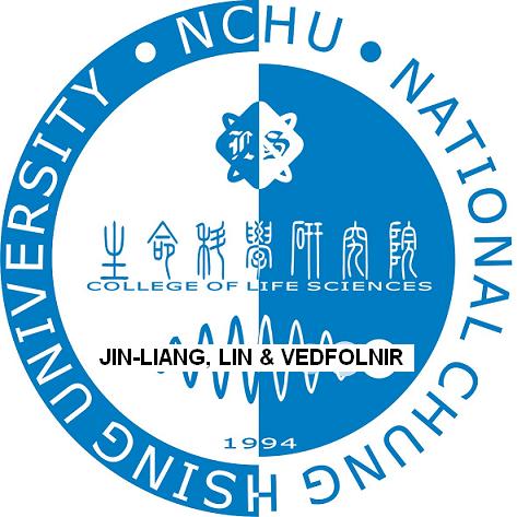
NCHU College of Life Sciences emblem competition
Design Concept for the NCHU College of Life Sciences Emblem
The design of this emblem adopts the most widely accepted circular form, expresses the concept of yin and yang duality through color, conveys the imagery of the origin of all things, and through the outer-ring and inner-circle design implies the close relationship between the university and the college.
In the outer ring, the design embeds “National Chung Hsing University” and its abbreviation “NCHU”; then, using elements such as the College of Life Sciences, “College of Life Sciences,” the founding year 1994, and a novel diamond-shaped logo incorporating the abbreviation “LS” for Life Sciences, they are perfectly integrated into the inner-circle design, making the overall design of the outer ring and inner circle full of a simple, lively style and a harmonious, rounded feel.
And through the innovative design of gradient patterns hidden within the harmonics that represent the signals of life, it metaphorically conveys the deep meaning of life’s growth and the passage of time, to showcase the infinite potential and the important mission bestowed upon the college in this new era.
Support Independent Perspectives & In-Depth Insights
Every thoughtful analysis and candid critique comes from our dedication to truth and quality. We choose not to follow sensational algorithms or clickbait headlines.
Sustaining independent research requires reader support. Make a one-time or monthly contribution, securely processed by Google.
Payments secured by Google · Manage or cancel anytime in your Google Account




Comments