
Google today unveiled a newly designed website logo and corporate identity system to keep pace with the arrival of the mobile generation. Through a sans-serif design, the Google wordmark becomes easier to recognize on small screens.
Although this time the new design is only being adopted in the search engine application for now, I believe it will soon be rolled out across all applications under the Alphabet holding company, such as Gmail, YouTube, Maps and so on.
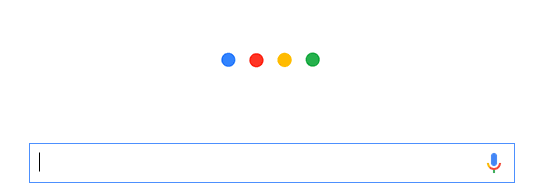
In the newly designed corporate logo and identity system, the four-color palette of red, blue, yellow and green that has been in use since the early days is maintained (yellow-green-red is McDonald’s), and three prototype designs are introduced, including four colored dots, four colored large letters, and the original Google wordmark.
Looking at Figure 1 below, the combination of four dots and colors makes Google’s representative image easily recognizable. But whether it can be registered as a graphic or color trademark is still hard to say[1] — after all, simple structures and common color tones usually find it harder to pass examination — but they’re Google (Mantou: it just feels super convincing).
Next, look at Figure 2: a single letter G, likewise filled with four colors inside to form a colored G.
Although only this one large letter is visible so far, the editor believes Google will adopt the same design principle for different applications. For example, the Y of YouTube, the K of Keep, or the N of News will gradually switch to sans-serif large letters filled with four colors. This design also fits the consistency required in a corporate identity system, and further represents the future integrated image of the Alphabet company.
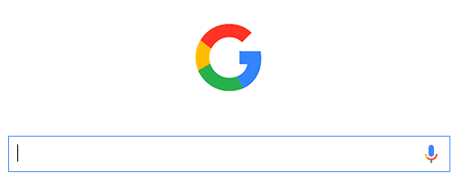
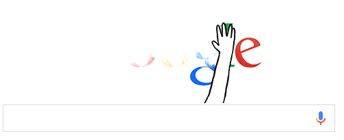
Figure 3 below is an interesting animation example from Google, showing the old serif typeface being wiped away and changed to the new logo design shown in Figure 4.
Next, please look at Figure 4 below — Google’s brand-new sans-serif typeface, using text that is easy to recognize and carries a slightly cute style to represent the freshly relaunched Alphabet company.
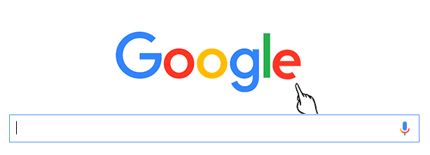
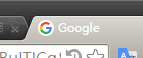
Please see Figure 5 below — even the website icon (Favicon) has been switched to the brand-new logo. I believe it will soon be extended to all applications under Alphabet. (Though after using it for half a day, the editor still isn’t used to it.)
Further Reading:
[1] Article 5 of the Trademark Act: “A trademark may consist of words, figures, symbols, colors, sounds, three-dimensional shapes, or any combination thereof.”
Support Independent Perspectives & In-Depth Insights
Every thoughtful analysis and candid critique comes from our dedication to truth and quality. We choose not to follow sensational algorithms or clickbait headlines.
Sustaining independent research requires reader support. Make a one-time or monthly contribution, securely processed by Google.
Payments secured by Google · Manage or cancel anytime in your Google Account


Comments